ÄrzteTeam 42
A multi disciplinary medical practice needed a website that actually helped patients find answers on their own. The redesign reorganized the information for how patients really search, rebuilt the frontend as a fast static site, and reduced the load on reception staff by making the most asked questions visible at a glance.
Impact
Patients answer their own questions
Opening times, services, doctor profiles, appointment options and emergency contacts were lifted from buried CMS pages to the surface so common questions can be resolved without a phone call.
Less phone load on reception
By making the most asked information findable in seconds, the website now absorbs a meaningful share of routine calls so reception staff can focus on patients in the practice instead of repetitive inquiries.
Modern, trustworthy presence
A contemporary visual identity, accessible typography and clean mobile behavior replaced an outdated CMS template, giving the multi disciplinary team a presence that matches the quality of care they deliver.
Part of a Patient Journey
This website is the at home half of a paired patient journey. It is where patients meet the practice for the first time, look up opening hours, services and doctors, and decide to come in.
Once they arrive at the clinic, they continue with Praxisautomat, the in clinic patient self service application I also redesigned, which handles sick note requests, medication, appointments and document uploads on the self service kiosk at reception.
Designing both sides as one connected experience keeps the language, hierarchy and self service mindset consistent from a patient's first question on their phone at home, all the way through their visit at the practice.
Read the companion case study: Praxisautomat · In Clinic
Problem and Role
ÄrzteTeam 42 is a multi disciplinary medical practice. Before the redesign, the site lived on a generic CMS template that was hard to maintain, slow on mobile, and structured around the CMS, not around what patients actually wanted to know. The clinic kept getting phone calls for things that should have been one tap away: opening hours, what to do outside opening hours, which doctor covers what, how to request an appointment, where to find the practice.
I joined as UI UX designer and frontend developer. I redesigned the information architecture around real patient questions, defined the visual system in Figma, then rebuilt the site as a static frontend so it loads fast on mobile and is easy to maintain. The goal was simple: every patient who lands on the site should find the answer they came for, without having to call the practice.
Goal
- Help patients self serve the most asked questions
- Reduce phone load on the reception team
- Modernize the digital presence to match the practice today
Observed Problems
- Information patients actually wanted was buried in dense CMS pages
- Mobile experience felt slow and cluttered, even though most visits come from phones
- The visual style felt dated and did not communicate the trust the practice has earned offline
- Reception was constantly answering questions the website should have answered
Hypotheses
- If the most asked questions are surfaced on the homepage, patients stop calling for them
- If pages are shorter and more scannable, patients trust the site faster
- If the build is static and lean, mobile users get answers in one second instead of waiting
- If the visual identity feels current, the practice gains trust at first impression
Approach
- Mapped patient intents (opening times, services, doctors, appointments, emergencies, location) and rebuilt the information architecture around them
- Designed a calm, accessible visual system in Figma with clear typography hierarchy and generous spacing
- Rebuilt the site as a static frontend in HTML, CSS and JavaScript for speed, stability and easy maintenance
- Made the navigation and key actions reachable in one tap on mobile
- Wrote each block so that a patient can scan and decide in seconds
Outcome
- Patients can resolve the most asked questions on the site without calling the practice
- Reception is freed up to focus on patients in the practice instead of repetitive inquiries
- Mobile performance and clarity match the quality of care the team delivers offline
- The new presence positions ÄrzteTeam 42 as a modern, patient first practice
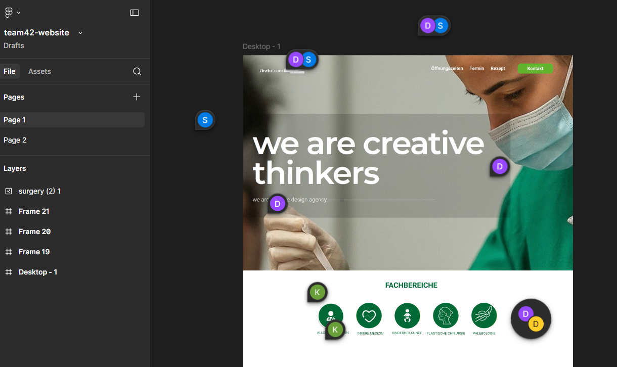
Client discussion in Figma
Figma was the shared workspace for reviewing early layout directions with the client. We discussed the content order, visual hierarchy and what patients needed to understand first, then used those comments to refine the structure before moving into the frontend build.
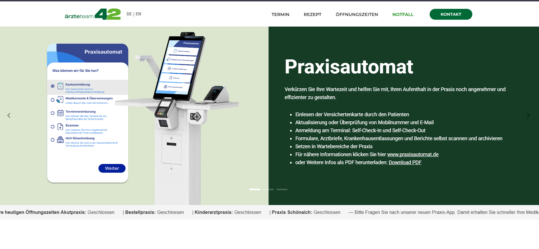
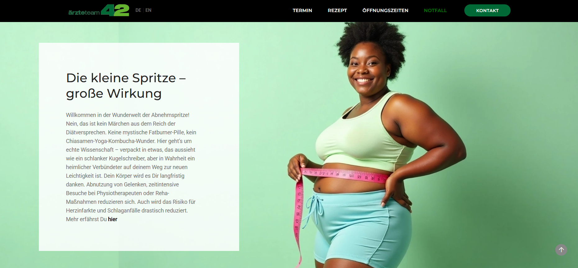
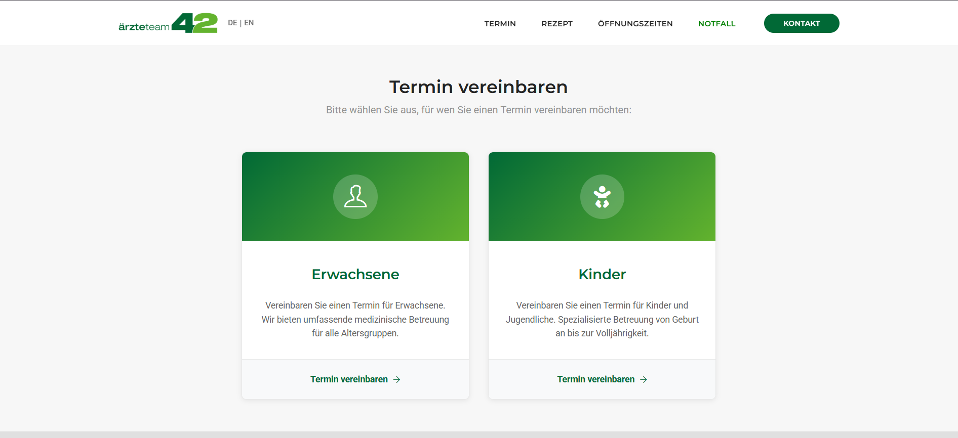
The redesigned site
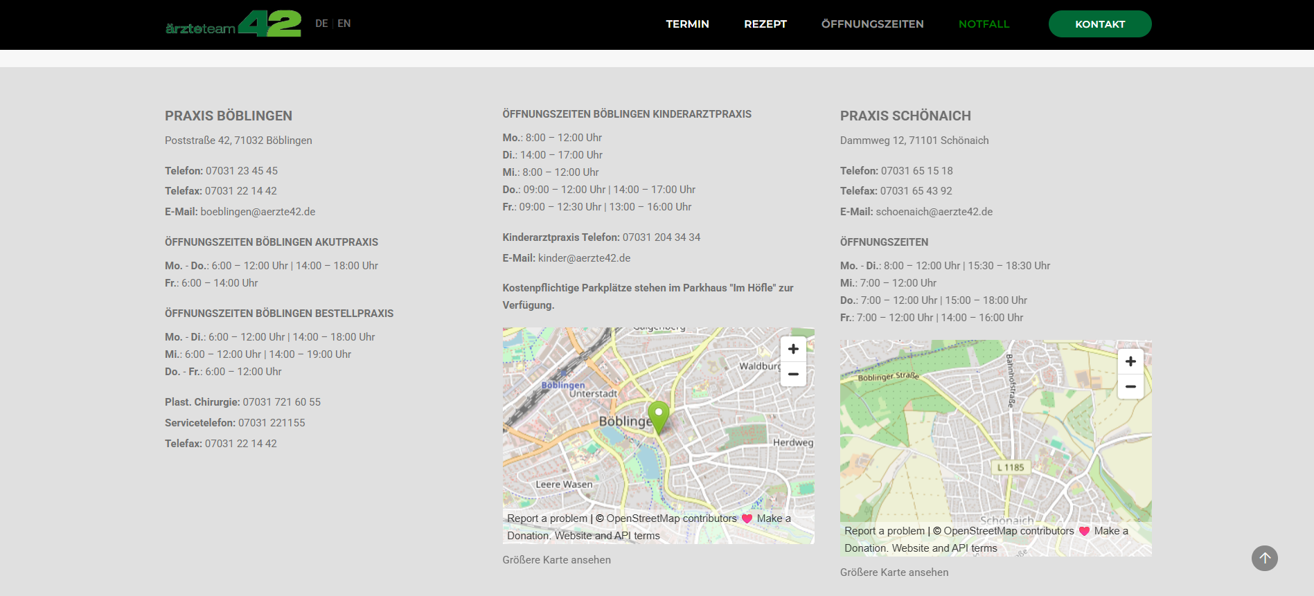
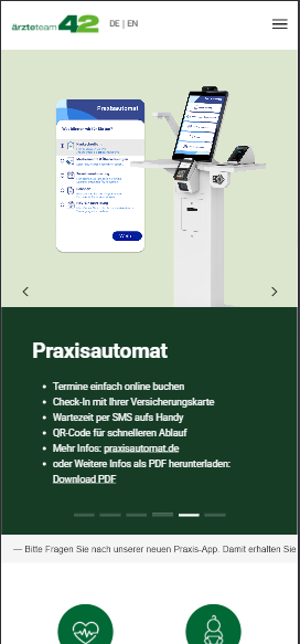
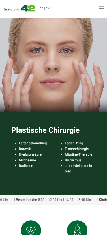
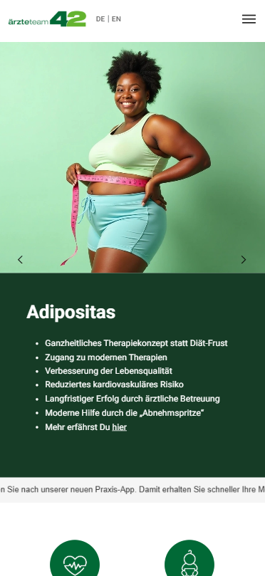
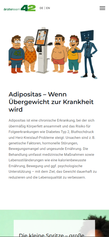
The new visual system across desktop and mobile. Pages are organized around real patient questions, with stronger hierarchy, generous spacing, modern photography and clear calls to action.
Desktop
Mobile
Result
The redesigned and rebuilt website in motion. The structure puts the most asked patient questions in reach immediately, while the visual system stays calm and trustworthy across the entire experience.
Personal Reflection
The strongest design lesson from this project was that for a medical practice, a website is part of care. Every minute reception saves on the phone is a minute someone in the practice gets full attention. Owning both the design and the frontend meant I could keep that focus from the first wireframe down to the last line of code, and ship a site that actually helps people instead of just looking better.