Praxisautomat
Redesign of a healthcare application that helps patients independently manage tasks such as requesting sick notes, ordering medication, and connecting with their family doctor. My focus was to simplify a crowded experience, improve accessibility for elderly users, and support the move from design into frontend implementation.
Key Achievements
Usability for Elderly Users
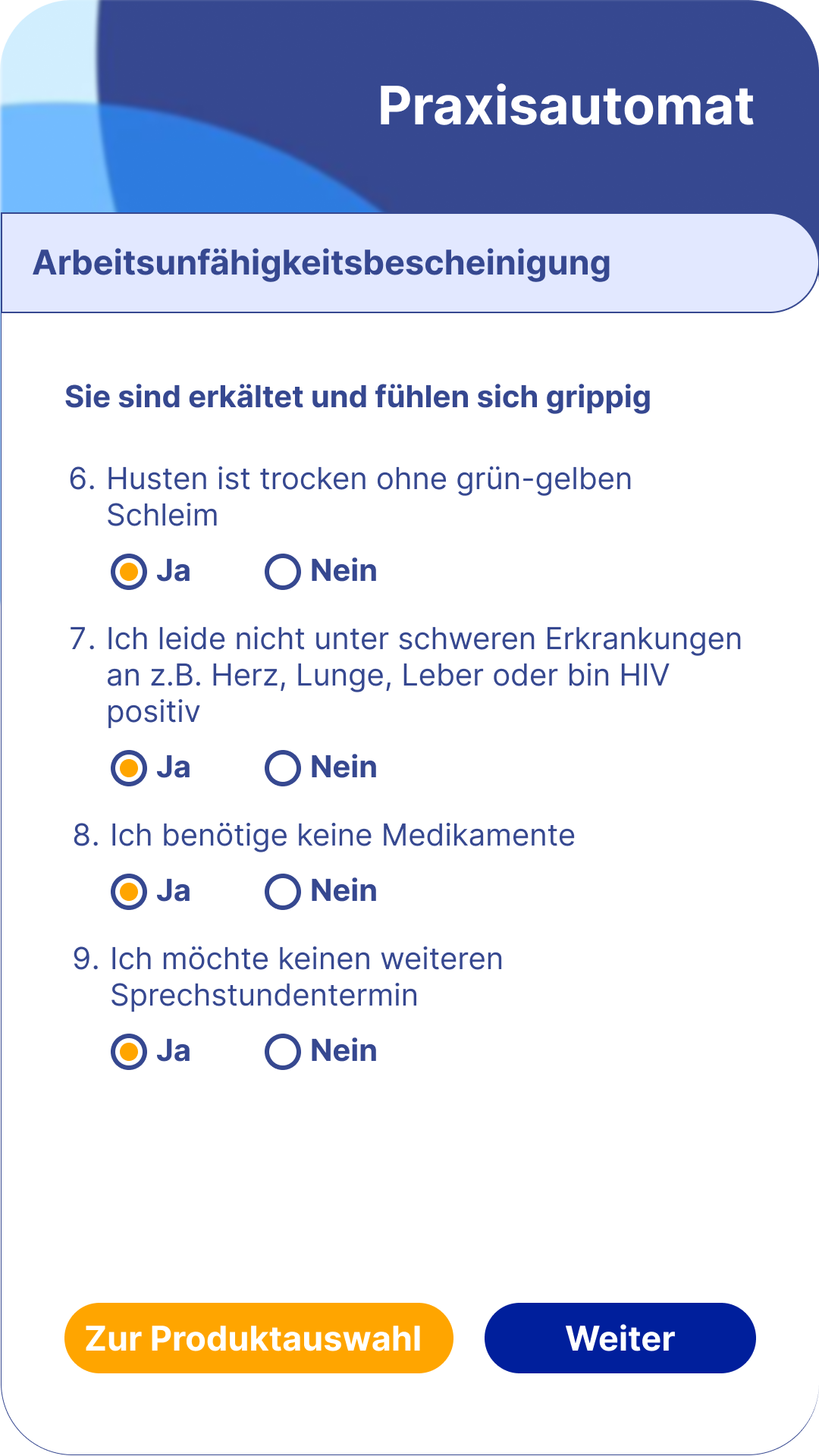
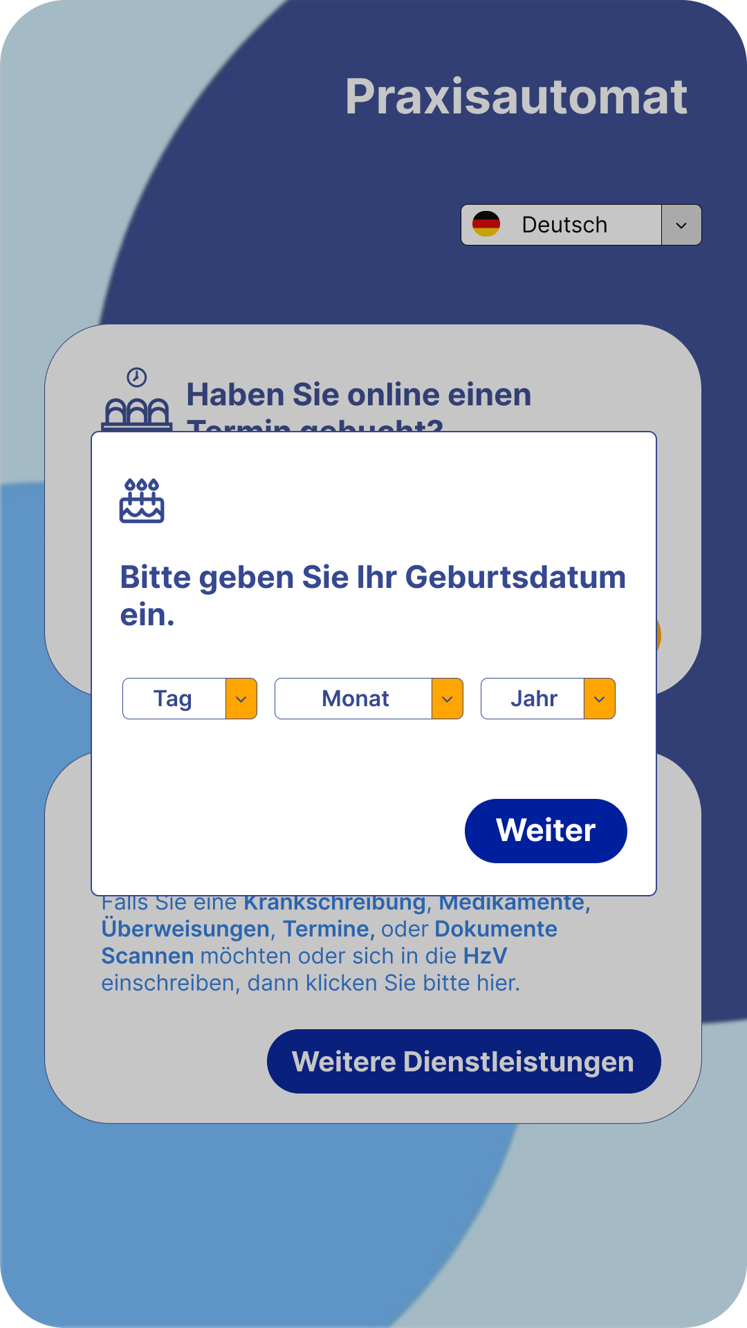
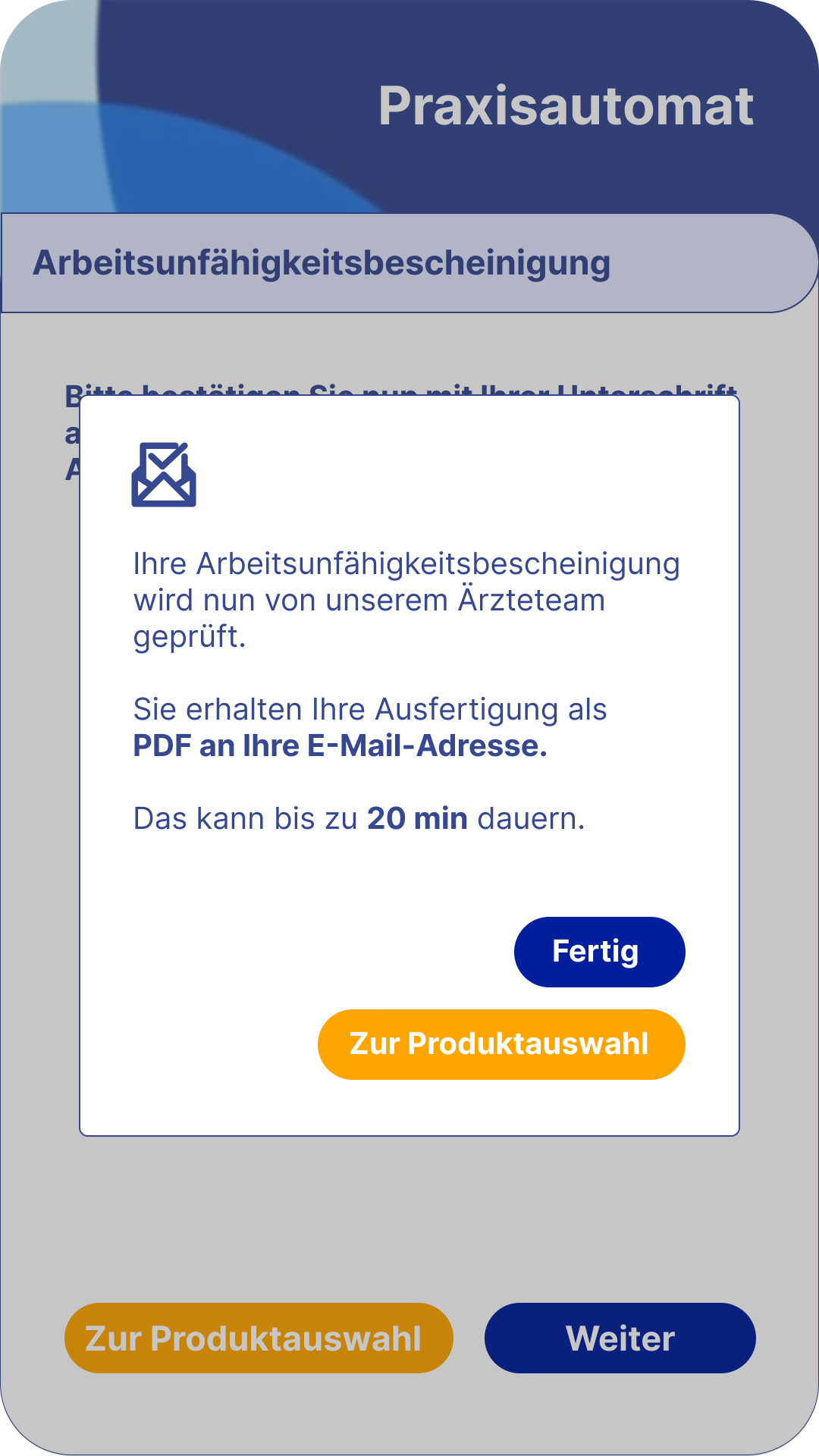
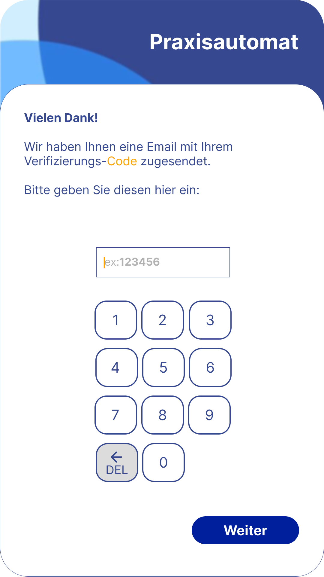
Restructured important tasks into clearer, guided steps so patients could complete actions with more confidence, including better support for scanning a health insurance card.
Innovative Enhancements
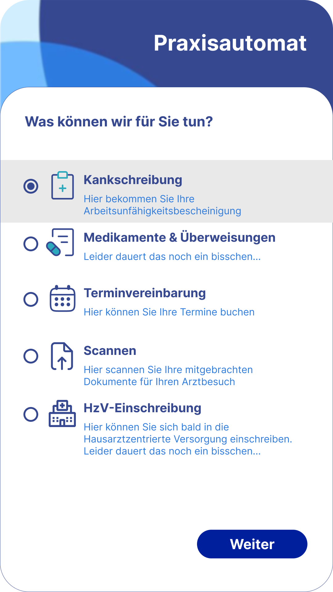
Introduced upfront service selection, improved form controls, and a clearer information hierarchy to reduce cognitive load and make decisions easier.
Accessibility & Visual Design
Refined typography, contrast, and color usage to create a more accessible interface that still felt warm, calm, and trustworthy for a healthcare context.
Problem and Role
The existing interface felt crowded, visually inconsistent, and harder to use than it should have been for patients completing important healthcare tasks. This was especially critical for older users, who needed clearer guidance, stronger hierarchy, and more confidence in multi-step flows.
I worked on the redesign as UI designer and developer, focusing on simplifying flows, improving screen structure, and translating the updated UI into implementation-ready frontend work.
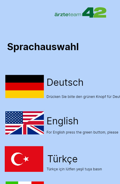
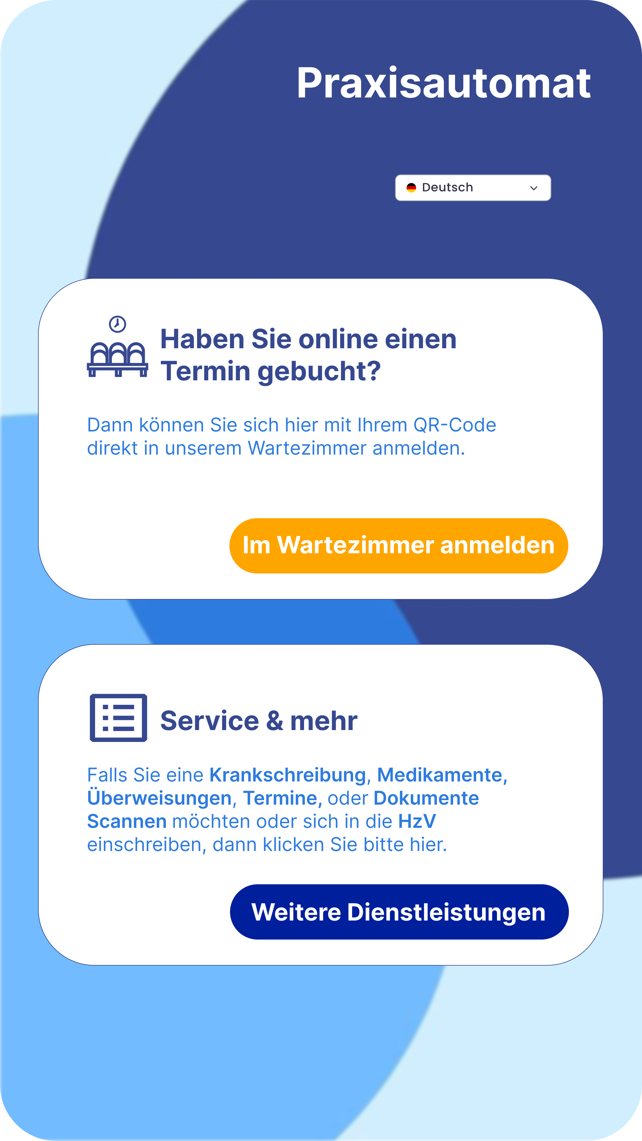
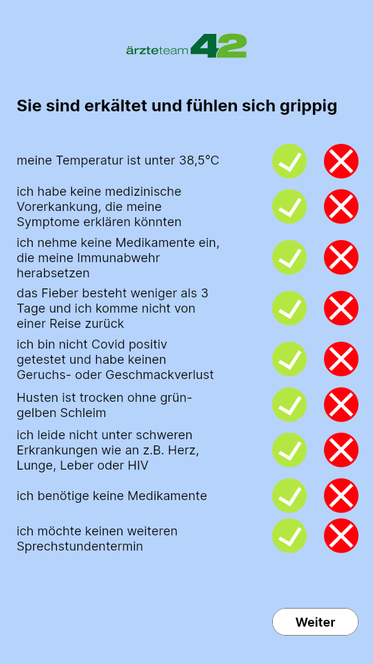
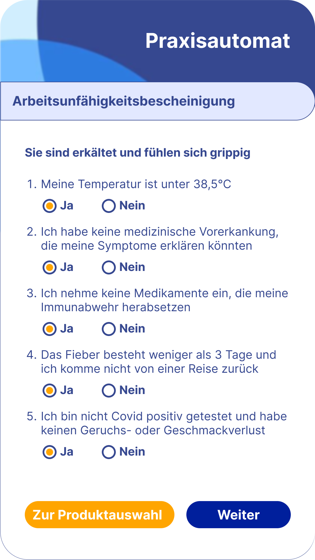
Before & After
Comparison of the old and redesigned screens showing how the product moved from crowded layouts and unclear actions to cleaner hierarchy, clearer decision points, and more accessible interaction patterns.

UI Details
A closer look at the redesigned screens, including refined components, improved form behavior, and a more consistent visual language across the application.
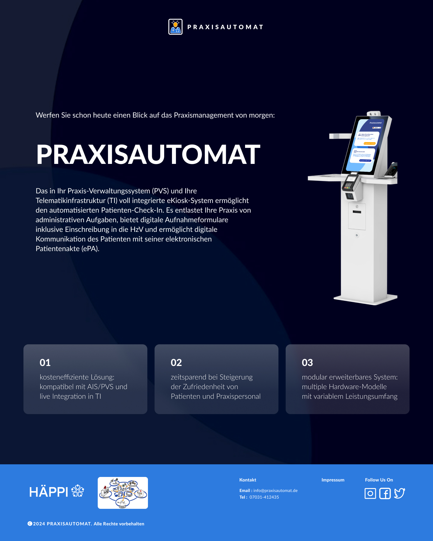
Website Design
Alongside the application, I also designed the Praxisautomat website so the first impression matched the product itself: clearer structure, accessible typography, and a more trustworthy presentation for both patients and doctors.