Square Capital Consulting
A boutique financial advisory firm needed a website that earned trust from the first scroll, a clean migration off WordPress without losing the SEO it had built, and a way to publish news without a developer being involved every time. I owned all three: the redesign, the static rebuild, and a token protected API workflow that rebuilds the magazine pages automatically.
Impact
WordPress to static, SEO preserved
Migrated content out of WordPress into a fast static frontend while protecting URL structure, page titles and metadata, so the search visibility the firm had earned over the years was not lost in the move.
Automated news, no manual rebuilds
Built a token protected API publishing flow: the content source is updated through a secured endpoint and the magazine pages are rebuilt automatically, with the layout verified across screen sizes for every release.
Trust by design
Dense financial copy was restructured into clear service messaging and a stronger founder profile. The result reads quickly, looks professional, and matches the seriousness clients expect from financial services.
Problem and Role
Square Capital Consulting is a financial advisory firm. The previous site ran on WordPress, looked dated, mixed dense service copy with weak structure, and tied every content update to a slow editor flow. For a B2B audience that judges trust within the first few seconds, this was a quiet but real conversion problem.
I owned the project end to end: UI UX direction in Figma, the static rebuild in HTML, CSS and JavaScript, the WordPress to static migration with SEO preservation, and the API based publishing pipeline for the magazine pages. Three goals had to land at the same time: a more trustworthy brand presence, a clean migration with no SEO regression, and an autonomous publishing flow for the client.
Goal
- Modernize the brand presence and the founder profile so the site earns trust on first impression
- Simplify dense financial copy into scannable service messaging
- Migrate from WordPress to a static frontend without losing SEO or breaking links
- Deliver an automated publishing flow so the client can update news without a developer
Observed Problems
- Dated visual identity that did not match the seriousness of the service
- Long, dense financial blocks that visitors had to wade through
- Slow WordPress publishing flow with risk of breaking layout on every edit
- Every news update needed a developer in the loop
- SEO equity from years of WordPress had to be protected across the migration
Hypotheses
- If the founder profile and service messaging lead, B2B visitors form trust within a few seconds
- If the site is static and semantic, it loads faster and is more stable than the legacy WordPress build
- If URLs and metadata are mapped carefully, search visibility survives the migration
- If publishing is moved behind a secured API endpoint, the client controls news and the layout never breaks
Approach
- Redesigned the visual system in Figma with a calmer, more confident tone for financial services
- Rewrote and restructured service messaging so the offer is clear before the visitor scrolls
- Rebuilt the frontend as a static site in semantic HTML, modular CSS and vanilla JavaScript
- Mapped legacy WordPress URLs and metadata to the new static structure to protect SEO during migration
- Designed a token protected API endpoint: the content source is updated through a secured request, then the magazine pages are rebuilt automatically
- Verified responsive behavior across screen sizes after every release so layout, links and content stay stable
Outcome
- The site is faster, more structured and easier to scan, with clearer service messaging and a stronger founder profile
- WordPress to static migration completed without losing SEO visibility or breaking the link structure
- News updates now go through a secured API and the magazine pages rebuild automatically, with no developer in the loop
- The brand presence now matches the trust the firm expects from its clients
Before & After
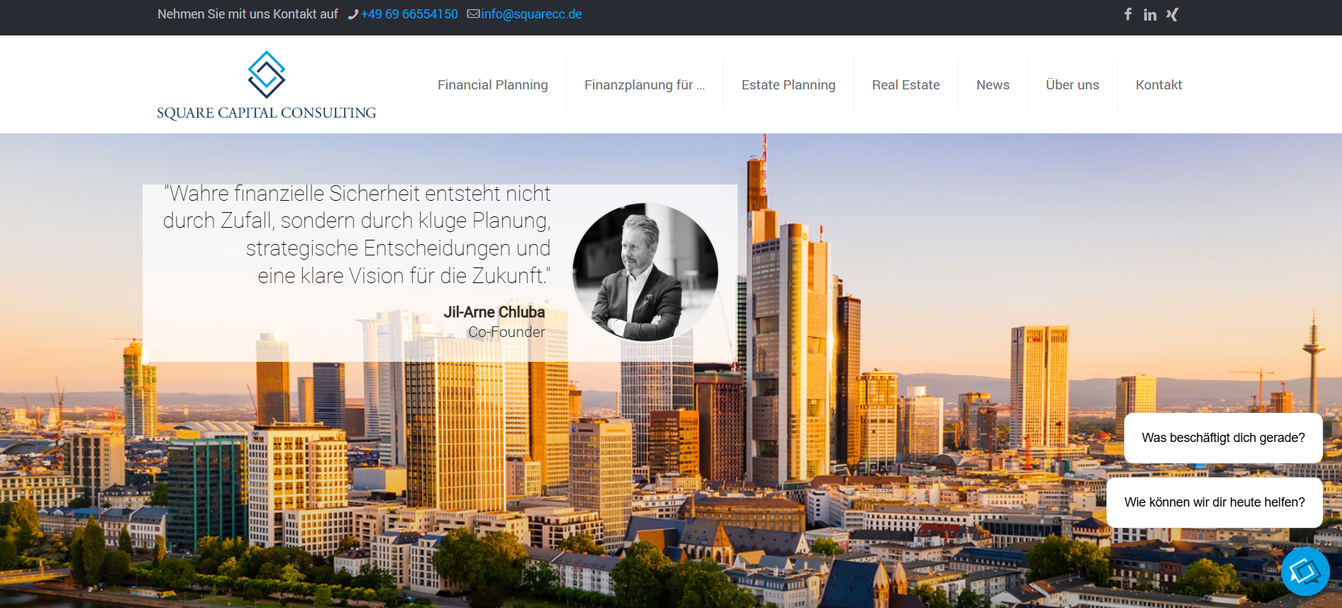
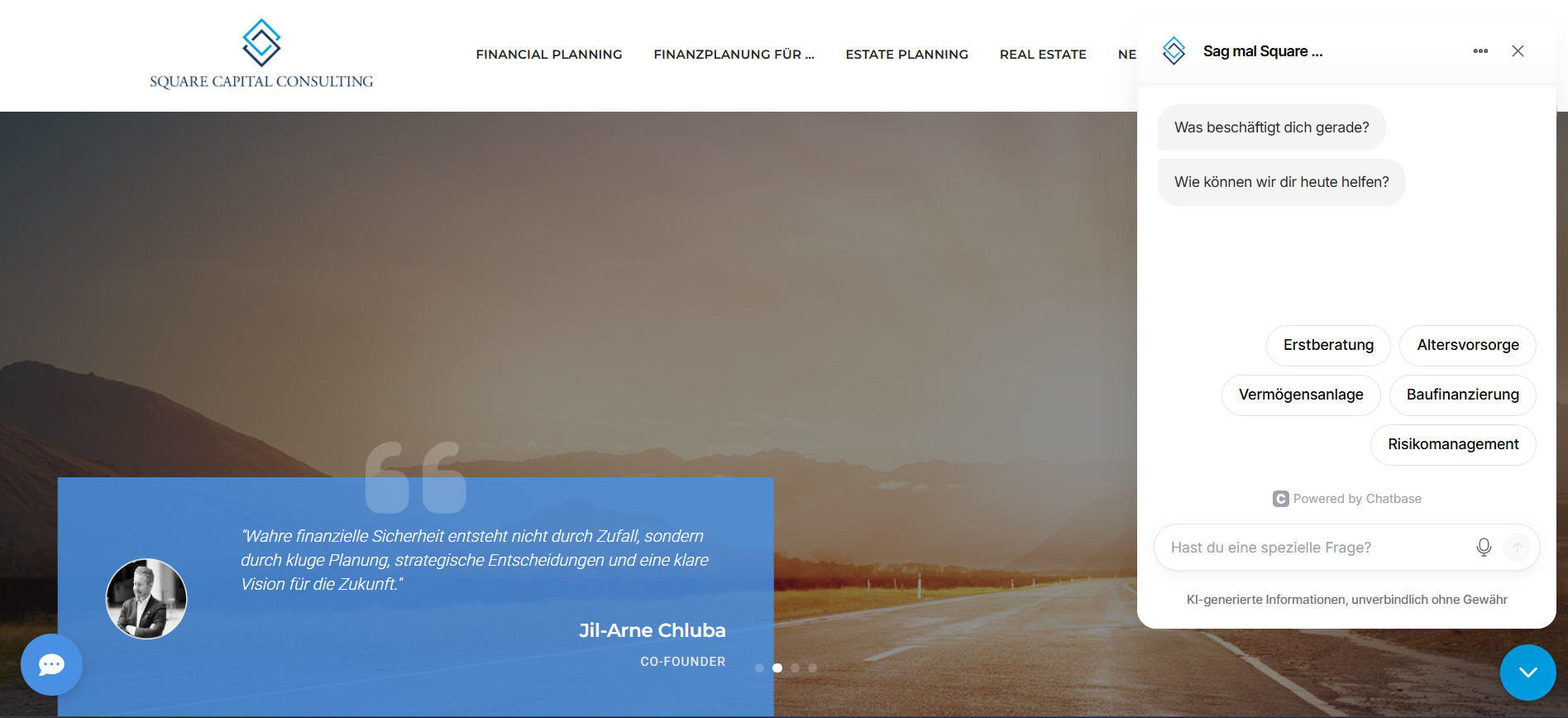
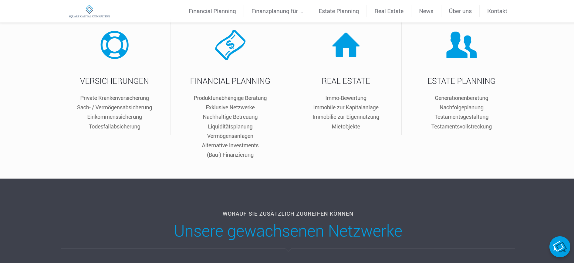
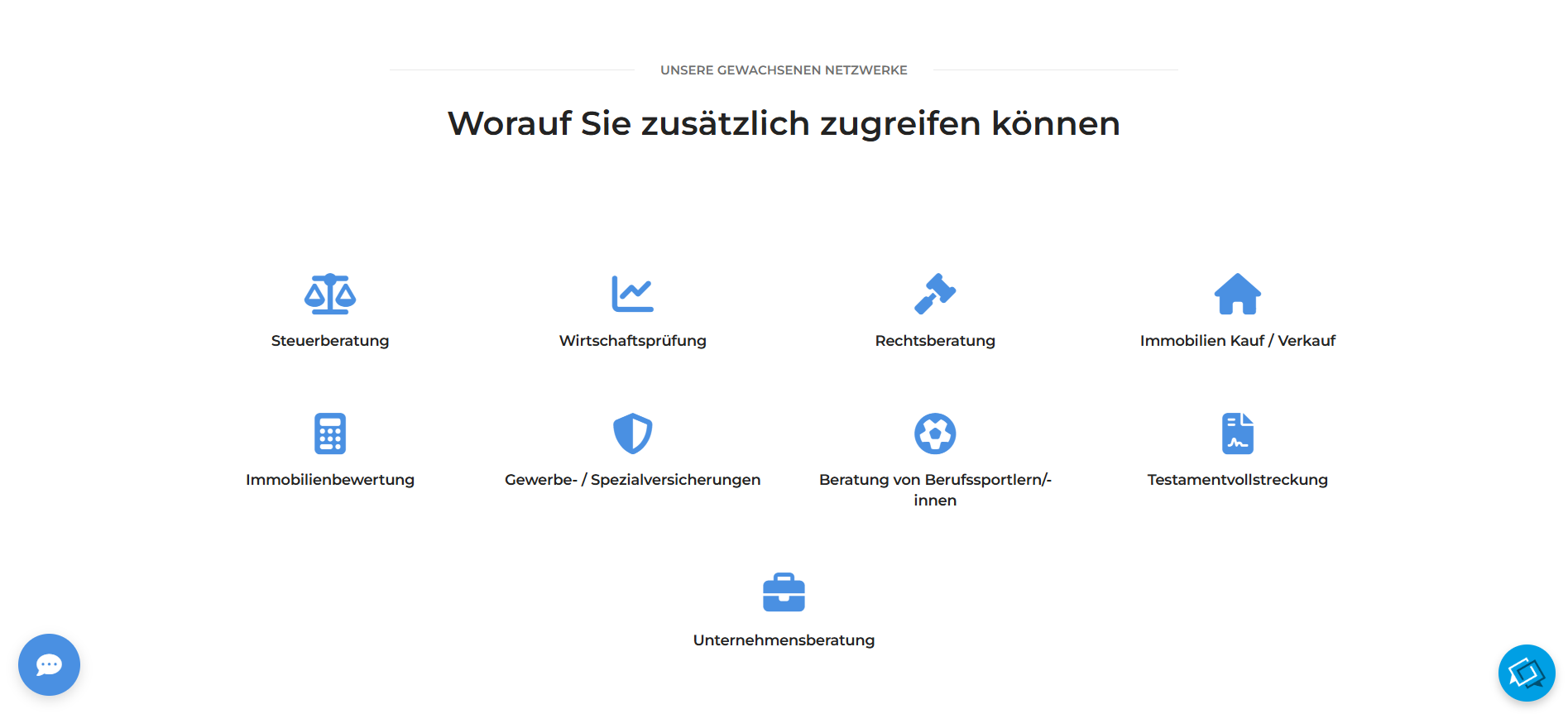
Side by side views of the same parts of the site, before the redesign on the left and after on the right. The shift is from a dense, dated WordPress build with an overlay heavy hero, small typography and a cramped footer, to a calmer visual system with clear hierarchy, more breathing room and stronger founder presence.
Hero and founder quote
Services overview
Stats and footer
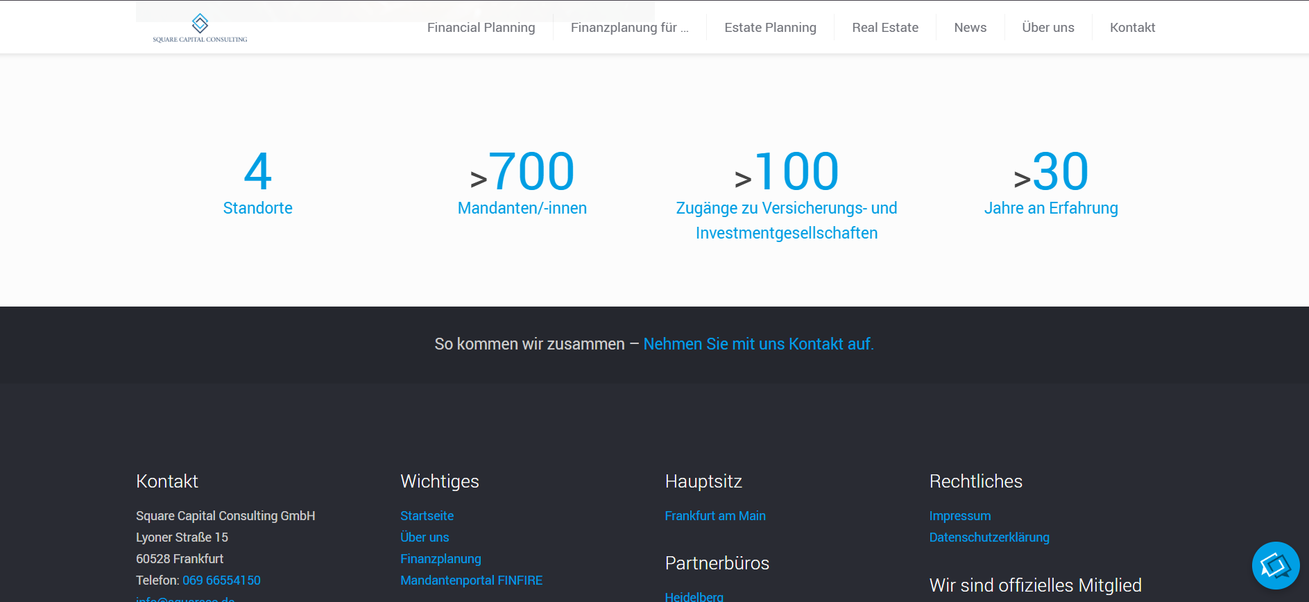
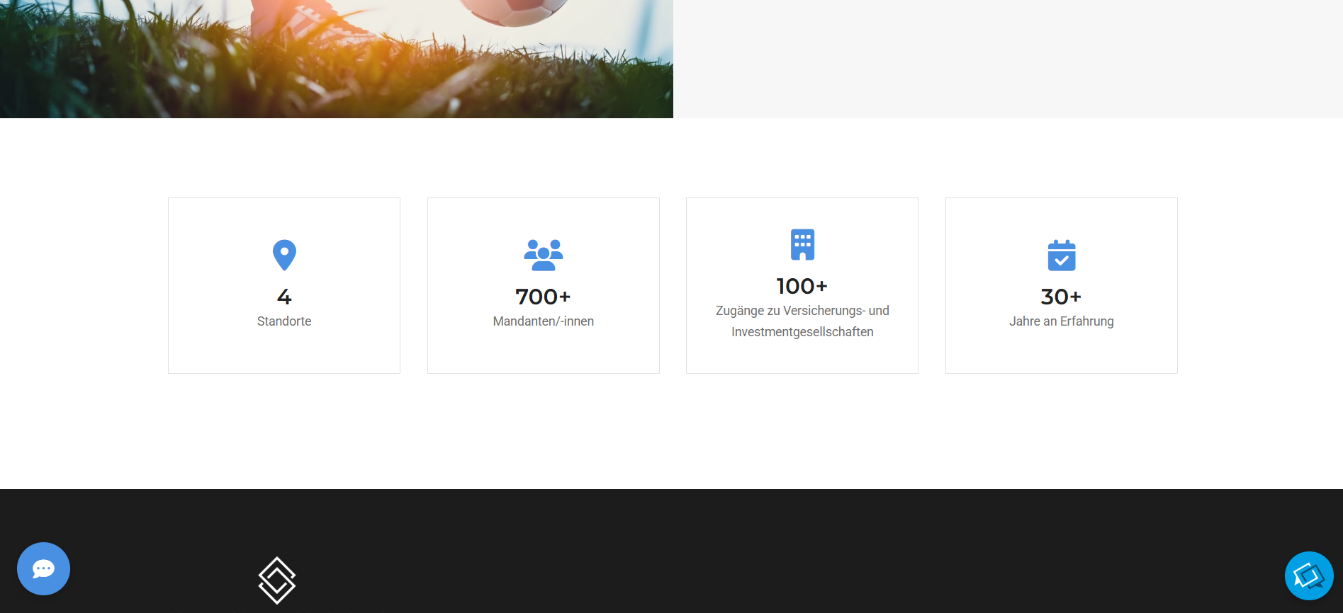
On Mobile
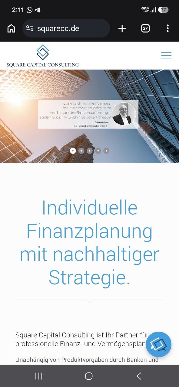
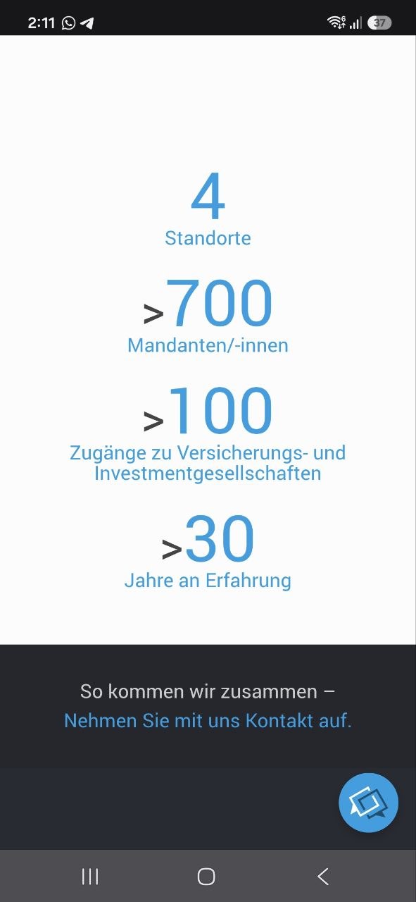
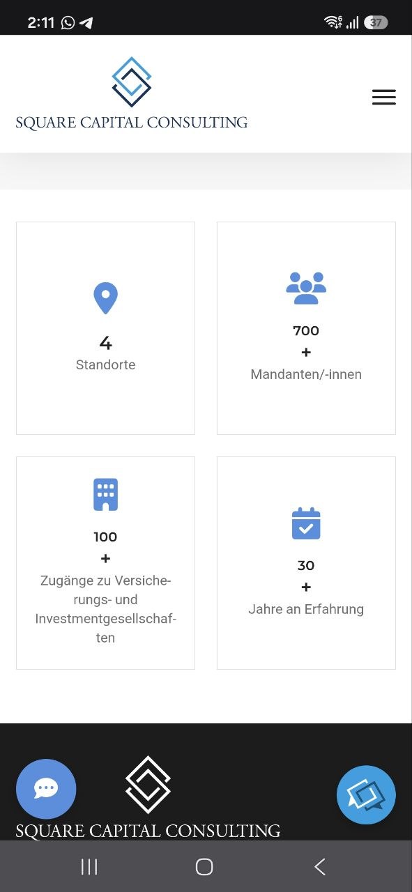
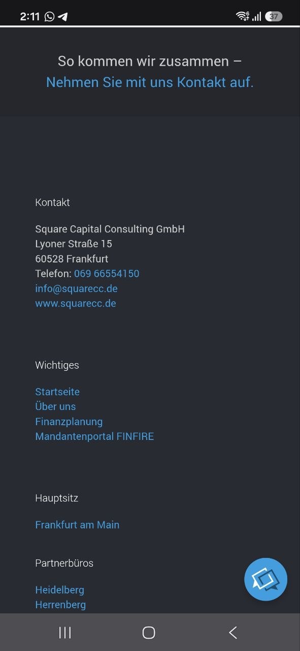
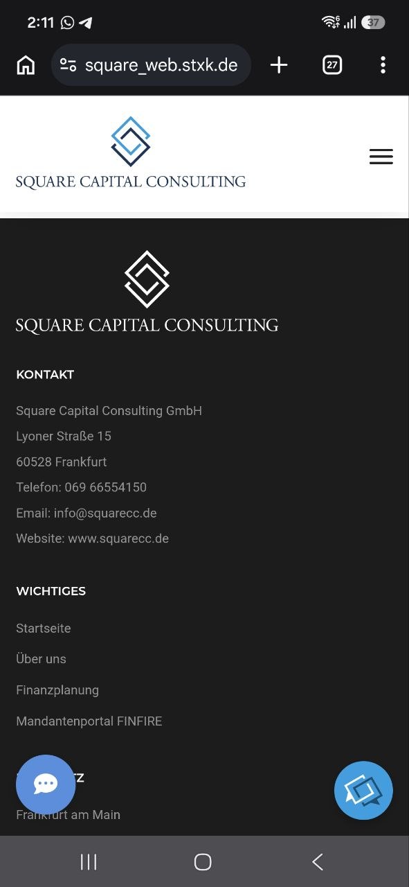
The same shifts carry through at phone size, where most clients actually meet the brand. Cramped overlays, plain text stats and a dense link list are replaced with calmer typography, card based stats and a footer that finally breathes.
Hero and founder quote

Stats
Footer
Result
Desktop and mobile views of the redesigned site. The structure leads with service clarity and founder credibility, while the magazine section keeps publishing fresh content through the automated API workflow.
.png)
.png)
Personal Reflection
The most rewarding part of this project was crossing the design and engineering line in the same brief. Trust comes from how the site reads, the migration protects the value the firm already had, and the API workflow gives the client a publishing loop they fully control. Holding all three together — visual direction, frontend execution and a small but real piece of automation — is the kind of work where my UI UX and frontend background actually shows up as one outcome instead of three handoffs.